Hello! This is a little update on what I have been learning in the past couple of weeks! I also mentioned some of my favorite techniques and tips! Enjoy!
An Ad Makeover
Introduction
I decided to challenge myself by trying to recreate an ad similar to current ad. I chose to recreate a Macy’s ad for their evening collection. In addition to creating a new ad, I create a slide presentation in Adobe Indesign as if it were a work presentation designed to present the ad. The presentation is an analysis of the two ads.

Message
Overall, I wanted the presentation and ad to scream Macy’s. I tried incorporate shapes and colors that I thought fit nicely in Macy’s company. For the ad itself, my message was the classiest men wear suits and they look strong and powerful. Simple and straightforward. The white background helps the image look more powerful and helps the image to stand out. The text is also bold and strong throughout it. Strong and simple, but classic.

Target Audience
My target audience for the presentation design was Macy’s. I choose colors that reflect their company and created a sense of familiarity. My target audience for the ad was 30-year old men who wear formal attire on a regular basis.

Design Principles
Shapes
Throughout the presentation, you will notice that I used a lot of triangles, some of the white and some of them red. I wanted them to reflect the star in Macy’s logo, which is sharp and crisp. The theme of my presentation was bold, simple and classy, I thought a triangle was simple, bold and classy.


Text
One of the hardest parts of this project was trying to recreate Macy’s text in certain parts of the presentation (on the first and last slide that is their text logo and I would like to give them credit. The text was obtained legally). I decided to challenge myself a little more and try to recreate the text on my new ad to try and match Macy’s text (the star is their logo and was obtain legally). It was pretty tricky, but I discovered that spacing when designing text was huge. A font looks so different depending on how you space it. The font in the ad and in their logo is a Serif font, so I used a San Serif font throughout the presentation to add contrast. The contrast to the add makes both stronger in the end.


Colors
For my color scheme, I just used shades from the original ad. By using the ad colors as my color scheme for the presentation, I thought make my presentation like conclusive. It would also help to promote the logo and Macy’s colors since the ad and presentation is supposed to focus and promote Macy’s. I knew my new ad may not have the exact color scheme, but I thought a photo with navy that would also go well with gray and red. The red was meant to ad contrast the dark and white colors, drawing your eye to the logo.


Repetition
I tried to use repetition in everything. As you look at the original ad, new ad and the slide presentation, you will notice the colors are repeated. I hope by repeating the colors, it would promote Macy’s theme. Triangles were also repeated to add a professional look and to remind the viewer of the star. Bold, strong, simple and classy.


Conclusion
Overall, it was a fun challenging to recreate the Macy’s ad. I focused on colors, shapes, repetition and text to replicate that ad and design the presentation. I tried to make every element reflect Macy’s image and design. Each elements adds flavor to the presentation and helps the main focal point of the image stand out throughout the ad.

Fueling passion through design

Our lives revolve around energy. The alarm clock ringing in the morning, the radio blasting music and the hot chocolate maker brewing in the morning. Batteries are tiny electrochemical cells that create chemical energy through a redox reaction. Batteries vary in size, but inside each battery is the same fueling source. The size may vary, but the power will not. Without energy, we are helpless left to wind to do as it pleases. It is momentum that drives us, so which force will you choose to fuel your passion?
Introduction
Over the past few weeks, I have focused on building my creativity. Part of becoming a new creative person was to create something that was a little little outside the box. For this project, I had a generator produce a random object with a random target that would have to be included in my final design. My subject become batteries for couples in their early sixties. Ready. Set. Begin.
Target Group
I wanted to choose something that was creative and eye-catching. Everyone needs batteries and they can become average quickly. I wanted to put the batteries into a photo that would make them seem cool and vintage. Transforming the normal vision of a battery was crucial to make the advertisement a success. . I didn’t want the battery to be overbearing, just like how a battery is in real life. It is subtle, but so much power comes from it and relied on daily.
Coloring
I tried to make the ad appeal to men by using trains and appeal to women through the coloring. The vintage tint also hopefully reflects their age. My color is scheme is basically just greens, grays and browns pulled directly from the photo. I have often found that if your color scheme is pulled directly from the picture, the more cohesive the advertisement becomes. I tried to blend the orange of the battery with the brown and blacks of the trains. Almost every color in the advertisement is light and faded. I wanted all the added portions of the photo to match the train so it didn’t seem so alarming or fake.
Text
The text was meant to also reflect vintage and be an addition Duracell’s logo. I tried to maintain the bold text from the Duracell and train logos throughout the advertisement. Adding repeating text throughout the advertisement hopefully added consistency and helped the advertisement to come together as one. It needed to contrast, but the contrast needed to add to the design and texture of the piece.
Conclusion
Creative thinking is challenging, but rewarding. Through design principles we can enlarge our mere creative visions into reality, unleashing the artist and child in each one of us. Creativity is bundled inside of each of us, each moment is another chance to create something breathtaking.
Seasons Through Design-Icon Set
Introduction
I wanted to communicate that seasons are similar but do change through an icon set. I wanted young children to see that even though the weather changes, there are still similarities. I also wanted them to see the patterns of growth throughout the seasons. I tried to use bright colors that would attract children and help them see the beauty of each season. It would be easy to make winter seem dark or to make summer have slightly wilted green instead of vibrant green.

Design Principles
My target audience is young elementary school students learning through flashcards their seasons throughout the school year.
I used a tri theme, each season representing a different portion of the color wheel. I choose to combine spring and summer but I still used different shades of green to make them separate. Some still have their own color scheme in adjacent color wheel theme, but the generally tone is the primary and secondary colors throughout the piece. I wanted each season to be viewed as good and so I wanted the colors to all represents happiness, hence why there is lots of bright colors.
I also used similar shapes to add repetition throughout each design and to show that they all correlate in the icon set. The tree shape is the same, the leaves are the same and the border is the same around each design. When doing an icon set, you should try to have at least three elements that maintain consistent throughout each design.
I tried to make the design playful, like something you would find in a children’s coloring book. The lines on the border are thick to help the image feel like a flashcard and represent crayons. Designs are simple, but communicate effectively!
Conclusion
Icon designs are simple, but still communicate a theme throughout colors and design. It is important that your design should be heavily influenced by your audience. Icon sets are repetitive, but each icon has its own story.
Designing for Boys
Introduction:
I have never designed piece of art that specifically targeted for boys and wanted to accept a challenge. For this article my target audience was for boys between the ages of 12-13 just coming into young men’s and starting to read more about the temple. I wanted to create a design that was inviting, but still powerful. I hope that as we go through this blog, you will notice that every element was done to encourage the focus to be on the temple.

My photo
Design Elements:
To begin, I tried to use strong shapes that would communicate power the temple represents. I wanted it to be simple and clean, but still creative. I wanted something different and fun for a young boys’ attentions span but not too over the top to district from the Spirit. I choose strong triangle shapes to communicate power and strength. The arrows honestly reminded me of scouting and I wanted to add some creative without making it too girly and I thought the clean shapes were a good fit. Hopefully the strong shapes would keep the viewers attention, keeping their eyes bouncing from element to element.

I pulled my color scheme directly from the pictures and then lighted the font color a little. It was actually the photo color that inspired me to make me to make my target group boys because the photo was just so beautiful and clean. I wanted the theme and the attention of the color scheme to pull you back to the image of the temple. I thought the colors were so clean and worked so well together in the picture, it would make sense I would just use them. I played around with other girly color schemes, but nothing looked good because the they clashed with the colors in the photo.

My Photo
I tried to use very clean text that was easy to read. I wanted it to be fun and bold, but didn’t distracting from the temple photo. The text on the front cover goes around the temple to showcase the point of the cover, the temple. I used a serif and sans serif font for contrast. The title and the headings are the same to add repetition and clarity to the page. I also made the heading title a different color font to break up the text and to make the page look more organized.
Conclusion:
I hope that by reading this post, you can tell what design elements were implemented to highlight the importance of the temple. I wanted the design to be targeted towards young men and be fun, but still sacred. The text, shapes and colors hopefully push your attention towards the temple and its sacred message.
Hand Crafted Photos
Introduction
A photo is never quickly shot without a plan. In fact, there are a lot of elements and planning to create an effective photo. One one is to use the rule of thirds, and yes, there is some math in photography. Another is depth of field the enhances elements of a photo. Lastly, leading lines that focus the photo. All elements are tools that draw the focus to the important elements of a photo.
Rule of Thirds

My photo

The rule of thirds is proportionally placing the subject of the photo in one of the main intersections of the grid. In this photo, we notices the the ballet shoes hit directly one of the intersections. Our eye is immediately brought to the ballet shoe because it lies on a the interest, which is pleasing to the eye. The rest of the photo also rest on the intersection lines and keeps the focus of the viewer.

Photo by Heie

Similarly to the photo above, we see the lighthouse rests on one of the main intersections of the photo. The lighthouse is the main emphasis in this photo, and because of the intersects, it attracts our eye. Perhaps there could have been a little bit more balance in the photo, but it is a very nice simple version of the rule of thirds. We may also notice the rocks reach their max potential at the intersect, focusing the photo again.
Depth of Field

My Photo

Depth of field is when part of the photo is blurred and the other part is focused. Blurring part of the photo guides the eye to the focus point of the pictures. It forces the viewer to notice what the artist had intended. It makes the focused element pop from the photo and highlights the contrast between the two different elements, which makes the photo even stronger.


In this photo, we notice an even bigger depth of field. We can clearly tell what the photographer wants us to see in the photo. Also notice that the colors are more distinct in the focused portion of the photo. The dullness surrounding the highlighted portion of the photo actually adds importance and support to the focused portion. Since nothing else is distracting from the focus of the photo, it makes an even bigger impact.
Leading Lines

My photo

Leading lines are lines the directly force the eye of the viewer to the main focus of the picture. Notices how all the lines work together and meet at one point on the image. Leading lines often point towards the back of the image and add some depth to the screen. The lines are often at an angle to create the depth.

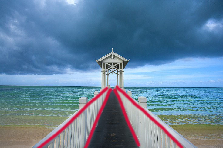
This photo has leading lines that create a strong sense of depth. We all know that most bridges lines do not curve in, but the picture appears to have a curving bridge. The reason the depth or curve is created because of the leading lines’ impact on the picture and the angle the photo was taken. Leading lines also create a focal point for the picture, which helps your eyes go exactly to main focus of the photo.
Conclusion
Overall, we see how different elements contribute to the attention of the photo. Rule of thirds, depth of field, and leading lines direct the eye of the viewer to the focal point of the picture. The tools mentioned above help the artist to place direct empathizes as needed throughout the photo. The tools capture and direct the focus of the picture.
The Art of Type
Introduction
In the 1940’s, Coco-Cola had already begun their legendary icon and descriptive text. Their typeface was not only intrigue to the perspective buyer’s attention, but would also later become a highly successful logo and trade-mark around the world. It is obvious that through their eye-catching ads, they explore the true possibilities of using type to enrich an advertisement.

Decorative Text

Coca-Cola is famous for its decorative text or logo. It is striking to the eye, but still is readable. It is smooth and classy, and accurately represents the era it was created. The text is bold and would have been something different, helping the ad to stand out from other competitors of its time and still has the same effect today.
Repetition

Once again, we notice another spot in the photo where Coca-Cola’s famous descriptive text can be found. Placing the text on the Jack Frost’s hat encourages the audience to see the text as brand and not just word . Exposing the audience multiple times to the eye-catching font makes it more memorable and familiar. Also notice that the text is in red and bounces off the other red box at the bottom of the screen.
Similarities/Difference

The descriptive portion of the text is obviously a lot take it, and the contrast of the other texts in the advertisement adds a nice variety. The bold and stocky structure of the contrasting text pairs nicely with the flows and curves of the decorative text. Allowing for two contrasting text actually allows both elements to become strong because they are working together vs. just a weaker stand alone element. We also notice a difference in text color, which also adds depth and helps certain words to stick out, and keeps a strong theme throughout the advertisement as colors are repeated. Although the non-decorative texts are slightly different, they both still fit in the San Serif text family.
San Serif Text

A San Serif text eliminates the extra flag that hangs over the ends of the letters. It is straightforward and bold. It is easy to read and works well with a decorative text. It is also an good text choice to carry the message of an advertisement as it is never leaves the viewer wondering what the text says. It is clean and gets the job done.
Size

The fonts in the advertisement range from varies sizes. The most important pieces of information are in the biggest fonts. The trade-mark text is interesting because it is small, but yet balance the size of the decorative text without being overbearing or distracting. It isn’t the most important element of the text, but is still there for those who want to read it without getting in the way of the message of the ad.
Conclusion
Overall, we see how different elements of text work together to communicate the message of the text. The different styles of text each play a different role throughout the advertisement, it might catching the viewer’s eye or carry the message of the ad. The contrast throughout the advertisement helps to make each portion stronger and more deliberate.
Breaking It Down
Introduction
Breaking down advertisements through different design elements allows us to see past the original photo and to truly understand the meaning of the work. The purpose of this post is to use contrast, proximity, color, repetition, and alignment to highlight the different elements of the photo. The message or design of the photo will be become much more noticeable as the elements unfold.

Contrast

In this photo, there is a very nice contrast between the purple flower, the white background, and the black screen of the cellphone. The purple flower is shocking compared to the glossy, black screen of the cellphone and almost pops from the screen as a 3-D effect as it shoots your attention to the text. The contrast is so sharp between each element that it grabs the viewer’s attention and locks the focus. Each contrast is clean, different, and crisp.
Proximity

The most critical element of proximity in the photo is the space between the text and the image. They are close together to show connection but still remain two very different, powerful elements. The space isn’t too close so that it appears cram, but stays within range so the message is easy to see. The spacing allows the image and text to work together to create the message of the piece.
Color

At a first glance, we see three colors. However, looking closer at the color of the flower, we see multiple shades of purple. The color gets brighter as the layers of the flower increase. The tension from the color getting lighter pushes our focus up towards the words. The color is also bright and is the first thing our eyes are drawn to, but is only a tool to move our eyes towards the real purpose of the advertisement, the text.
Alignment

The alignment throughout the photo is somewhat basic, but still has an effect. The flower is perfectly centered on the screen, but the words match perfectly above the flower. The center of the flower goes clearly through the center of the words, keeping the the flow of the piece connected between the two elements. Your eyes shift between the flower and the words, continually bouncing between the two pieces of the message. The point of the alignment of the flower is to push your eyes towards the words located directly above.
Repetition

The main repetition in this piece is the consistency of the text’s font. It allows for the words to remain the focus without a large amount of distraction from bring in another element of text. The color of the font also matches the color of the phone, and provides an element of classic or timeless. There are several different colors of phones or text that could have been used but keeping them the same eliminates adds unison to the work.
Conclusion
The elements of repetition, contrast, color, proximity, and alignment push the viewer’s focus towards the meaning of the piece , to buy an apple fun. The elements work together to add layering to the pieces as well as depth instead of just saying everyone should buy an Apple phone. The colors excite us while the black gloss soothes us. The contrast catches our attention and moves our focus towards the repetition of the font’s text. Each elements’ goal is to highlight the message.
First blog post
This is your very first post. Click the Edit link to modify or delete it, or start a new post. If you like, use this post to tell readers why you started this blog and what you plan to do with it.
